OPENTABLE APP-REDESIGN
OpenTable is an app that allows users to access, reserve, and rate dinning spots. This is a self-initiated redesign case study.
The Challenge:
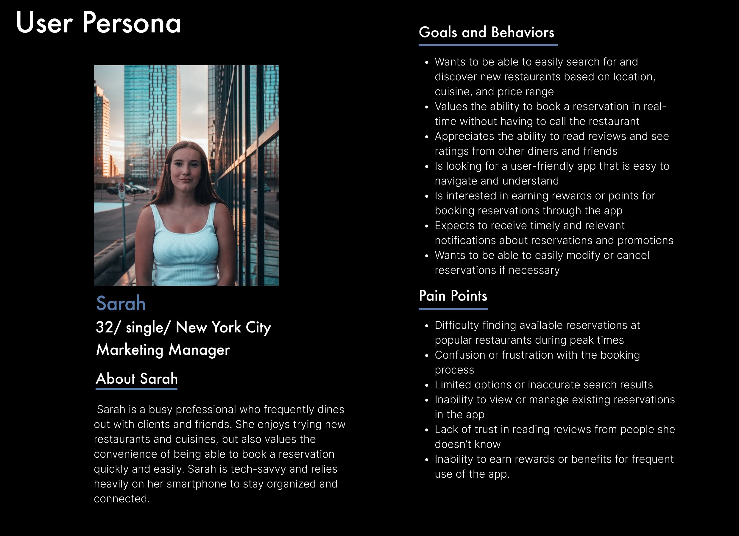
How can I enhance the experience and increase trust for returning users?
The Why:
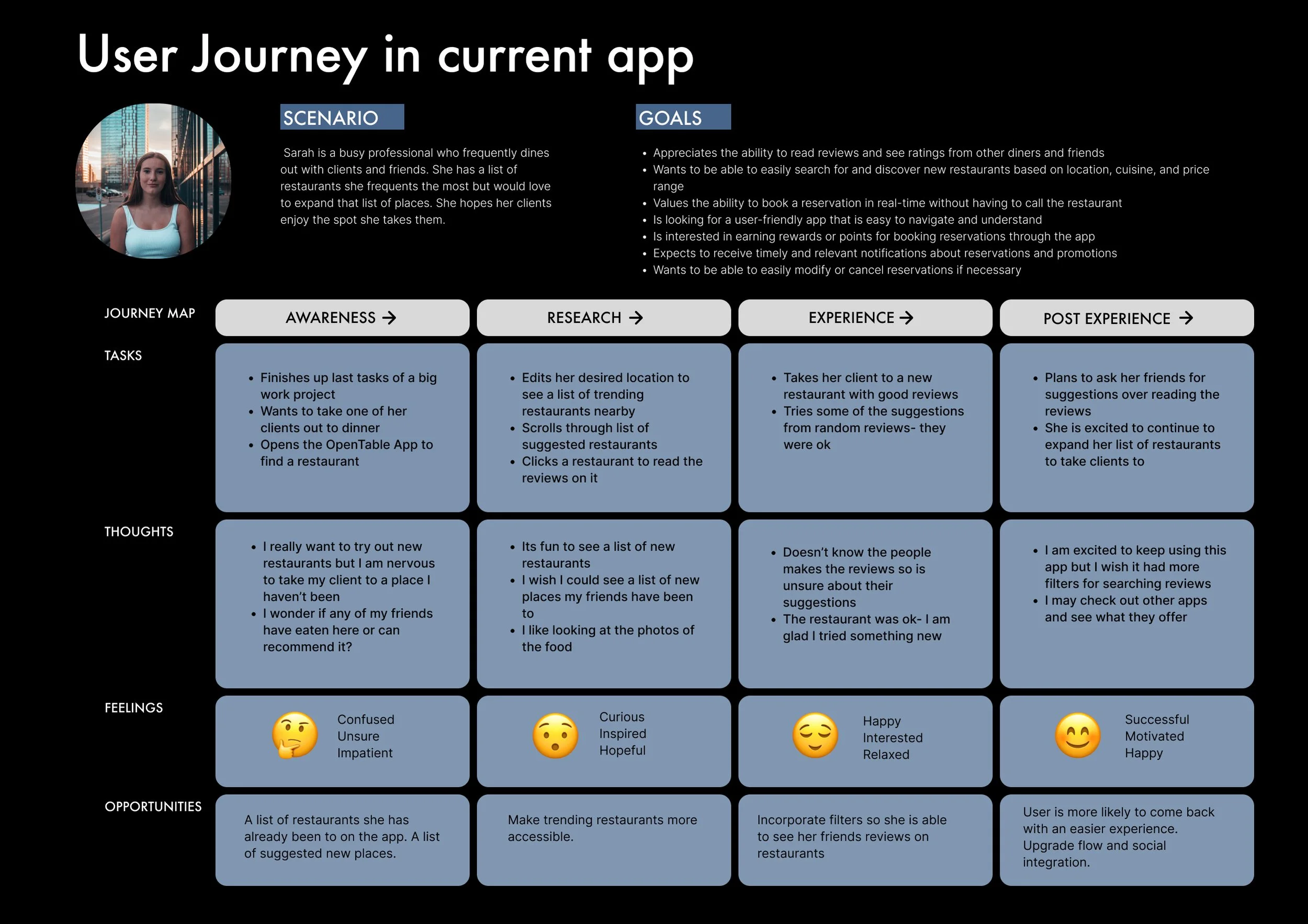
Users are lacking trust in reviews because they do not know the people leaving the reviews.
The Solution:
Based on my research findings, the proposed solution involves integrating social media, which will foster a greater sense of trust between users and the app, consequently leading to improved user retention.
Self Initiated Re-Design: UI/UX Case Study
Duration: 7 weeks
Client: OpenTable App
Project: UI/UX Design
Role: UX Research, Product Strategy, UI Design, UX Design, Prototyping, Usability Testing
Tools: Figjam, Figma, Maze, Notion
HOW I TACKLED THIS PROBLEM
01- Discovery Research
02- USABILITY REVIEW
03- COMPETITOR BENCHMARKING
04- USER PERSONA AND JOURNEY
05- MIND MAP
06- USER AND FLOW
07- IDEATION- WIREFRAMES
08- LO FIDELITY MOCK UPS
09- HIGH FIDELITY MOCK UPS
10- USER TESTING
-
How can I enhance the experience and increase trust for returning users?
-
Gain user retention and an increase of booking conversions.
-
I did some discovery research and surveyed 30 people. These were my 3 findings
1- Users would try a new restaurant if their recommended it
2- Users find a lot of the reservations apps too time consuming to make reservations
3- Users value good photos and high ratings for making their selections
-
Taking in my findings with my research, the solution I am proposing is to add social media integration. This will establish a higher level of trust between the user and the app and higher user retention.
-
I uploaded my prototype in the Maze App and had 20 people test my prototype. Here I was able to see any problem areas in the layout.
The 3 New Features to focus on
New added features:
#1
#2
#3
#1 Social Page
Add your contacts and verified users to follow on a social page
#2 Contact Groups
Add your contacts and verified users to follow on a social page
#3 Groups for Reservations
Use your groups to automatically send out reservation confirmation
See below for my research and how I came to this design
01- Discovery Research
I surveyed 30 young adults that frequently eat out.
Important User Needs
People prefer recommendations they trust
“I would try this restaurant if it had been recommended by my friend”
Users find a lot of the reservations apps time consuming to make reservations
“Sometimes its faster to just pick up the phone and call to make reservations”
Users really value good photos and high ratings for making their selections
“Service, Quality, Price, Past Ratings”
80% ask their friends for restaurant recommendations
Important insights from research
65% of people use apps to book a reservation.
96% of people read reviews before visiting a restaurant.
02- Usability Review findings
Existing features have good design and user flow qualities
I see opportunity and value added in accessibility and connectedness to the users social network
Could use better text hierarchy on page
03- Competitor Benchmarking:
To make sure my solution was competitive in the industry- I conducted a competitor review to see where their strengths and weaknesses were.
Direct Competitor: Yelp app/ Indirect Competitor: Tripadvisor


05- MindMap
When prioritizing my ideas, I focus on both the user value and business value, asking myself: "How can I enhance the ease of connecting returning users with their friends?"
Key Learnings:
Improvement- I found that I was passionate about expanding on profile information and personalization features
Add- I found adding different ways of integrating the social aspect was something that was high on the priority list
06- User Flows
There is no option to filter results when viewing reviews. Per my discovery research- users really find value in recommendations of people they know and trust.
Frustrations:
I added a Social Page, another avenue to view reviews and also more features while booking a reservation
Solutions:
07- Ideation
Wireframes
I sketch out the key UI components of my concept with adding the social element to the existing OpenTable app to visualize the user-flow.
08- Lo-fidelity mock up
I reviewed my wireframes with other designer to see where I can improve flow and usability. I take their feedback and move into lo-fidelity mock ups.
Whats new
See a side by side of a the current app and my new improved app
BEFORE
New Design
AFTER
#1- see how many people you know that have visited
#2 - added space to the information section
#3- optimized middle tab bar options
#4- added groups feature
#5- available times easily visable
#6- improved navigation bar with Social feature and updated icons
Whats new
09- High-fidelity Prototype
High-fidelity Prototype Flow
Click play below to view a video of my user flow of the onboarding screen, social page, home page and making a reservation.
Or click here to see my Figma Prototype.
10- Usability Testing
What Comes Next?
Testing, Feedback & Iteration! After gathering user feedback, it became evident which areas of the flow and information on the website needed improvement. My next course of action involves redesigning the "next" button and incorporating additional information screens to enhance the clarity of the flow.
Screens to rework
These screen had high mis-click rates as you can see on the heat pattern.
Problem 1: The logo on the top right hand corner was confusing the user- they seemed to want to click it to continue.
Solution: Remove the logo there
Problem 2: Users seemed confused on where to click to make selections
Solution: Add a hover state to the component to make more accessible and easy to understand


